States indicated with * are analyzed using their 2010 plans, as I do not yet have their 2020 data.
States indicated with * are analyzed using their 2010 plans, as I do not yet have their 2020 data.
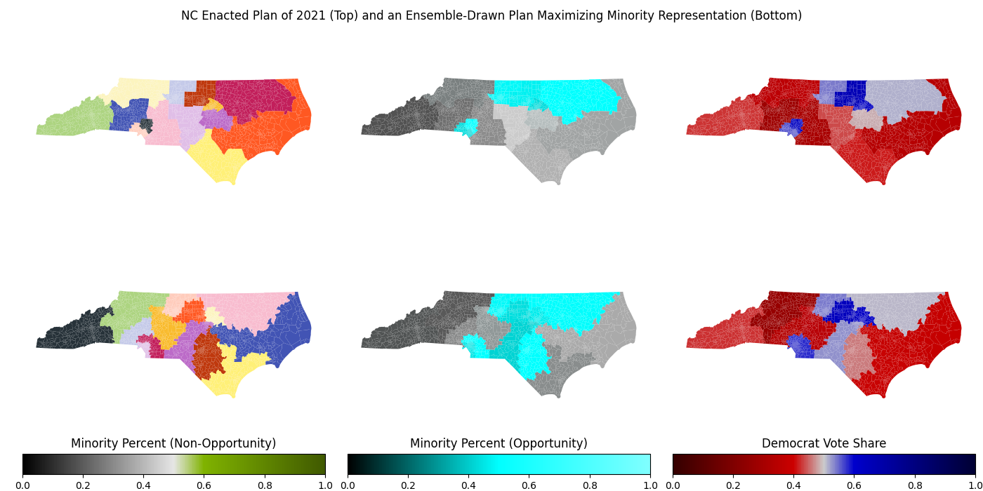
Districting plans that suppress minority representation are illegal under the Equal Protection Clause of the 14th Amendment. Under the loosest interpretation of this restriction, any map that, when compared to maps in the ensemble, contains a below-average number of minority opportunity districts is illegal. More liberal interpretations of this restriction may require plans to maximize minority representation when it is possible to do so without sacrificing traditional redistricting principles, such as compactness and preservation of communities of interest.
A district is categorized as a minority opportunity district if one of the following conditions are satisfied:
- At least 53% of the district's population is of a racial minority. The additional 3% above the majority-minority baseline is necessary to ensure that minority voters are able to elect a candidate of their choice, even if their turnout is depressed.
- At least 53% of the district's vote share in a 50-50 national environment goes towards Democrats, and minority voters make up a majority of the Democrats' voter base so that they can elect their desired candidate in the primary.
Currently, my algorithm assumes that 80% of minority votes are for Democrats regardless of geographic location (which has a significant effect on how people vote). I based this estimate off of the 2016 national exit polls, in which roughly 79% of minority voters voted for Clinton, and the 2020 national exit polls, in which roughly 74% of minority voters voted for Biden. In the future, this can be improved upon by using an ecological interference model to estimate how individual minority groups voted in each precinct. This will give a much more accurate result than assuming every minority group gives the same share of their votes to Democrats.
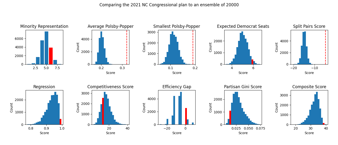
Suppose a certain district has perimeter P. Then the Polsby-Popper score for that district is the ratio of the area of that district to the area of a circle that also has perimeter P. See this article for more information.
Unusually low Polsby-Popper scores may be an indicator of long, snaking districts that are highly gerrymandered. However, every score must be taken in context with the rest of the ensemble. For example, a district that includes Michigan's Upper Peninsula naturally has an extremely low Polsby-Popper score, as it needs to take in a lot of small, jagged islands, as well as the rough Upper Peninsula itself.
The probability of a Democrat winning in each district is calculated using two normal distributions overlaid on top of each other. The first normal distribution is centered around the Democratic vote share in the district and has standard deviation 0.03, representing cycle-level differences in the Democratic vote share. The second normal distribution is centered at points drawn from the first normal distribution, has standard deviation 0.02, and represents district-level variations in the Democratic vote share. The expected number of seats won by Democrats is the sum of all of these values throughout each district. This works by Linearity of Expectation, a mathematical property that allows us to ignore the fact that Democratic vote shares in the same election cycle are correlated with each other.
This is essentially a simplified version of the Bayesian hierarchical model used by PlanScore to calculate the probability of each party winning an election in each district. The largest difference is that this simplified version recenters the Democratic vote based on the partisan lean of the overall election (explained in the "Boxplot" section).
Timmy is a voter who doesn't remember what district he lives in! For some reason, instead of searching for this information on Google, Timmy asks a random person that lives in his county what district they live in. The split pairs score of a county is the probability that Timmy and the random person he asked live in different districts. The split pairs score of the entire map is the sum of each county's split pairs score.
For some reason, I negated this score. This doesn't affect anything, however.
A plan that splits fewer counties and attempts to keep split counties mostly intact is less confusing for voters. Conversely, a plan with a large number of county splits and few intact counties is not only more confusing for voters, it could also be an indication of gerrymandering.
As the ensemble-generated plans are blind to county boundary lines, they tend to trespass these indiscriminately. Thus, if an enacted plan has a split pairs score similar or not much higher (or even lower) than the plans in the ensemble, it could be an indicatino of gerrymandering.
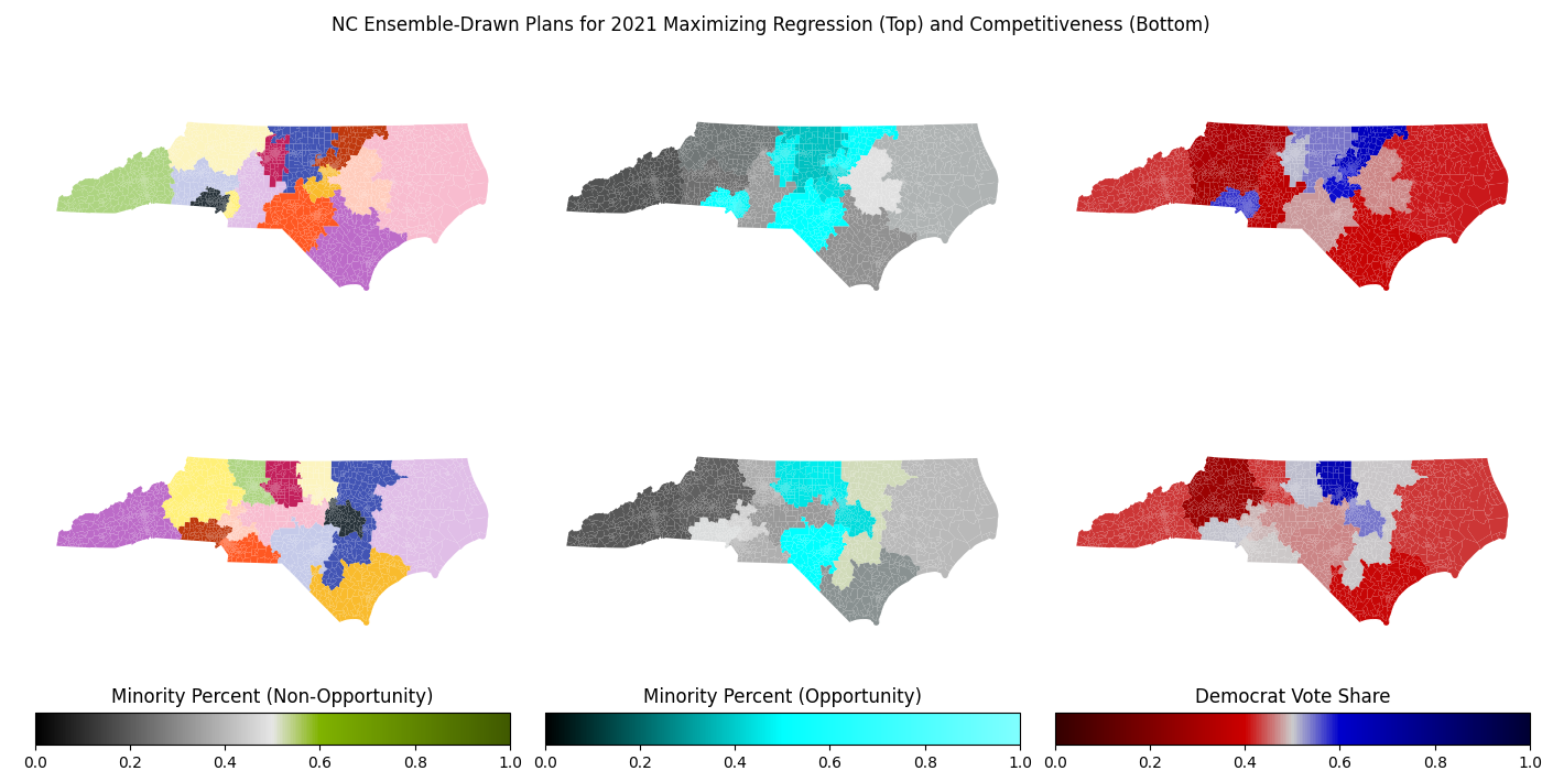
To calculate the regression score of a plan, the districts are first sorted by their Democratic vote shares (see the boxplot in the next section). Next, the program fits the points to a linear regression and calculates the R-squared coefficient. A low regression score indicates that the enacted plan may have an unnecessarily large jump in the partisan leans of its districts, an indicator of gerrymandering.
Comparing an enacted plan's regression score to the scores of plans in a large ensemble allows us to examine the plan's regression score in context of the political geography of the state. Doing so allows us to see that in some states, such as Ohio and North Carolina, a near-perfect regression score of greater than 0.99 can be achieved, while in other states like Pennsylvania, reasonably compact plans that achieve a regression score above 0.95 are extremely rare.
The competitiveness score for each district is calculated by finding the party that is less likely to win the district, then doubling the percent chance that this party wins the district's election. This caps the district's score at 100. The competitiveness score for the entire map is computed by averaging the competitiveness scores for each district in the map.
Competitive elections make it easier for the public to hold their elected officials accountable, so a plan with a high competitiveness score could promote more responsive (and responsible) elected officials. However, this can also be an indication of a failed gerrymander: that is, a map with formerly "safe" districts for one party that voter realignments have made more competitive. Examples include Georgia's 6th and 7th Congressional Districts, as well as Virginia's 10th Congressional District, where I used to live, in the late 2010s.
Each party only needs a simple majority of the votes, or 50% and one additional vote, to win. Every vote above this 50% +1 threshold for the winning party, and every vote for the losing party, has no effect on the outcome. We call all of these votes "wasted votes."
To calculate the efficiency gap, we first subtract the number of wasted votes for the Democratic party from the number of wasted votes for the Republican party, then divide this number by the total number of votes. An abnormally large efficiency gap, especially when compared to the efficiency gaps of plans in the ensemble, is usually a reliable indicator of gerrymandering.
For more information, check out this article.
Like with calculating regression, we sort each district by their Democratic vote shares. However, instead of using points, we use a histogram with the x-axis scaled from 0 to 1. So for example, if we are trying to draw a map of n districts, the district with the second-smallest Democratic vote share would have a bar running from 1/n to 2/n, and its height would be its Democratic vote share.
To calculate the partisan Gini score, we find the area of this graph's intersection with its reflection about (.5, .5). Abnormally high partisan Gini scores are strong indicators of partisan gerrymandering.
After computing all of these metrics, we need to redo some of them! For the category "expected Democrat seats," we calculate the average throughout all plans in our ensemble, then replace every value with its (positive) deviation from the mean. This means both an excessive Republican number of seats and an excessive Democratic number of seats are weighted the same way, instead of having one positive and one negative. Next, we normalize the metrics so that their standard deviations in the ensemble are roughly 1. Additionally, we assign negative weighting for metrics where a higher value is indicative of gerrymandering, such as the partisan Gini score. After taht, we scale important metrics up and less important or already covered metrics down. For example, average Polsby-Popper is scaled down by about 50%, since important parts of it are already covered by minimum Polsby-Popper. Finally, we add all of these together to produce the composite score.
An enacted plan with an abnormally low composite score must have scored low on multiple metrics, meaning it failed many gerrymandering tests and was likely drawn to be either a racial or partisan gerrymander (or both).
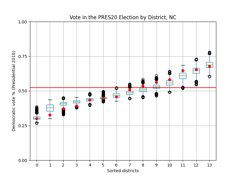
Here, the red line denotes the "lean" of the election to adjust for overly strong elections for either party. For presidential elections, this "lean" is the Democratic two-party vote share nationally, while for gubernatorial elections, this "lean" is the state's partisan lean (calculated by averaging the Democratic two-party vote share in the two most recent presidential elections after adjusting for the national vote share) subtracted from Democratic two-party vote share.
All districts displayed are sorted from lowest to highest Democratic vote share. The red dots represent the Democratic vote shares of districts in the initial plan.
One sign of gerrymandering is if there is a suspicious absence of red points close to the red line. Points within 5 percentage points of this red line (or 0.05 on the plot) are considered to be competitive districts, meaning that both parties have a significant chance of winning elections held in this district. Thus, a plan with a lack of these districts means that elections under this plan are largely predetermined: that is, one party's dominance in each district is nearly guaranteed.
We can also compare the red points to the boxplots' positions. If a large proportion of the red points are outliers, especially if they lie further away from the red line than the boxplot does whenever the boxplot is close to the red line, there's a high chance that the starting plan was drawn with partisan interests in mind.